This notebook introduces the core ideas of economic and business forecasting: what forecasting is, why it matters for policy and business, and the key properties of time series data — trend, seasonality, cycles, and stationarity.
import matplotlib as mplimport matplotlib.pyplot as pltimport numpy as np# Edinburgh paletteUOE_RED ='#7A2318'UOE_GOLD ='#B8860B'UOE_BLUE ='#2a78d6'UOE_GREY ='#52514e'COLOURS = [UOE_RED, UOE_BLUE, UOE_GOLD, '#2ca02c', '#9467bd', '#e377c2']mpl.rcParams.update({'figure.figsize': (10, 5),'axes.prop_cycle': mpl.cycler(color=COLOURS),'axes.spines.top': False, 'axes.spines.right': False,'axes.labelsize': 12, 'axes.titlesize': 14,'font.size': 11, 'legend.fontsize': 10,'lines.linewidth': 2,})print("Plotting style set ✓")
Plotting style set ✓
1.1 What Is Forecasting?
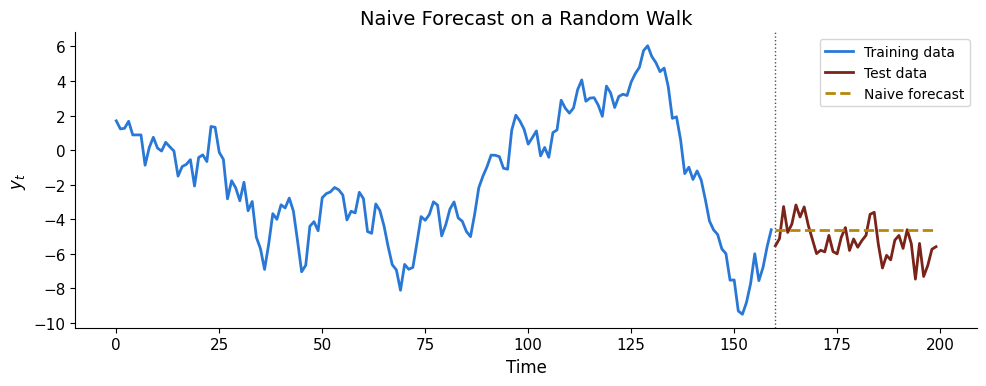
Forecasting is the process of making predictions about future values of a variable based on its past behaviour and possibly other information. In economics and business, good forecasts underpin monetary policy, fiscal planning, inventory management, and financial risk assessment.
Key question: given observations \(y_1, y_2, \dots, y_T\), what is our best prediction of \(y_{T+h}\) for horizon \(h \geq 1\)?
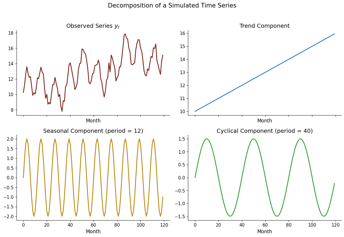
1.2 Simulating a Time Series with Trend, Seasonality, and Noise
np.random.seed(42)T =120# 10 years of monthly datat = np.arange(T)# Componentstrend =0.05* tseasonal =2* np.sin(2* np.pi * t /12)cycle =1.5* np.sin(2* np.pi * t /40)noise = np.random.normal(0, 0.5, T)y =10+ trend + seasonal + cycle + noisefig, axes = plt.subplots(2, 2, figsize=(12, 8), sharex=True)axes[0, 0].plot(t, y, color=UOE_RED)axes[0, 0].set_title('Observed Series $y_t$')axes[0, 1].plot(t, 10+ trend, color=UOE_BLUE)axes[0, 1].set_title('Trend Component')axes[1, 0].plot(t, seasonal, color=UOE_GOLD)axes[1, 0].set_title('Seasonal Component (period = 12)')axes[1, 1].plot(t, cycle, color='#2ca02c')axes[1, 1].set_title('Cyclical Component (period = 40)')for ax in axes.flat: ax.set_xlabel('Month')plt.suptitle('Decomposition of a Simulated Time Series', fontsize=15, y=1.02)plt.tight_layout()plt.show()
1.3 Stationarity
A time series \(\{y_t\}\) is covariance stationary if:
\(E[y_t] = \mu\) for all \(t\) (constant mean)
\(\text{Var}(y_t) = \sigma^2\) for all \(t\) (constant variance)
\(\text{Cov}(y_t, y_{t-k}) = \gamma_k\) depends only on \(k\), not \(t\)
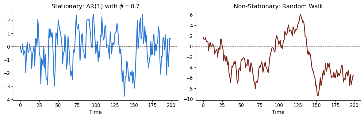
Most forecasting models require stationarity — or at least that we can transform the data to achieve it (e.g. differencing).
# Stationary vs non-stationary seriesnp.random.seed(7)eps = np.random.normal(0, 1, 200)# Stationary: AR(1) with |phi| < 1y_stat = np.zeros(200)for i inrange(1, 200): y_stat[i] =0.7* y_stat[i-1] + eps[i]# Non-stationary: random walky_rw = np.cumsum(eps)fig, (ax1, ax2) = plt.subplots(1, 2, figsize=(12, 4))ax1.plot(y_stat, color=UOE_BLUE)ax1.axhline(0, ls='--', color=UOE_GREY, lw=1)ax1.set_title('Stationary: AR(1) with $\\phi = 0.7$')ax1.set_xlabel('Time')ax2.plot(y_rw, color=UOE_RED)ax2.axhline(0, ls='--', color=UOE_GREY, lw=1)ax2.set_title('Non-Stationary: Random Walk')ax2.set_xlabel('Time')plt.tight_layout()plt.show()
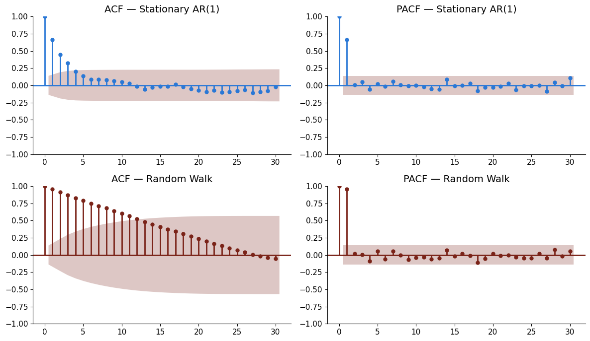
1.4 Autocorrelation Function (ACF)
The ACF measures how correlated \(y_t\) is with its own past values: